In a world of millions of websites, color is one of the best ways to make yours feel distinct. Color also plays a huge role in helping people recognize your brand quickly. So it’s not just fun, it’s useful!
After you’ve planned your site and started building it, you’re probably excited to get to the more creative part. If you have a color in mind already, or you’re not sure where to start, this article will walk through some of the basics of picking colors and applying them to your website, including:
-
- Three simple strategies for using color on your website
- Where to find colors you like and how to find their exact “color code”
- How to apply that color code to your website
- Examples of other Jimdo websites using color in easy ways
Think color pairing, not color palette
Many articles on color and web design direct you on how to create a color palette entirely from scratch, using color theory, color wheels, and the like. In this article, I’m going to steer clear of that approach.
First of all, because it’s unnecessary —there are tons of other ways to find good colors for your website that don’t involve a deep dive into anything with the word “theory” in it.
The second reason is that creating a color palette from scratch often results in too many colors, especially if you’re a beginner designer. For most purposes, you really only need at most two or three colors on your website. They will be much easier to manage and use well if you aren’t trying to juggle too many.
If you’re enjoying playing with color and want to learn more, there are lots of great design resources that can go deeper. For this article, we’ll start with the basics.
Choosing the right colors for your business
A big part of selecting colors is choosing something that you personally like. It’s also a good idea to think about the emotions that certain colors convey, and whether or not those fit with your website’s intended message. Some colors fit better to bright and fun personal blogs, meanwhile many professional websites tend to have milder or more “serious” tones. Though none of these color rules are carved in stone, they can help you narrow down your choices.
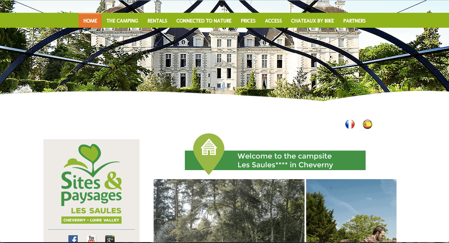
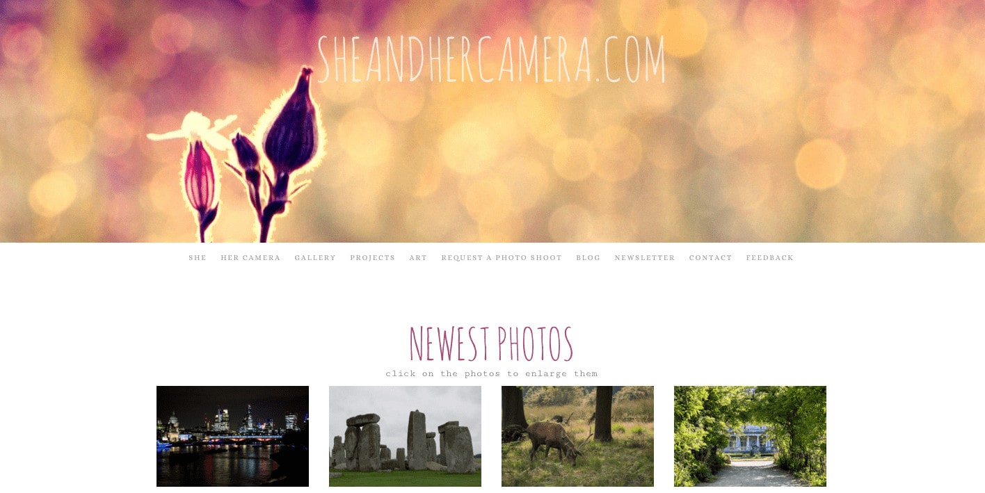
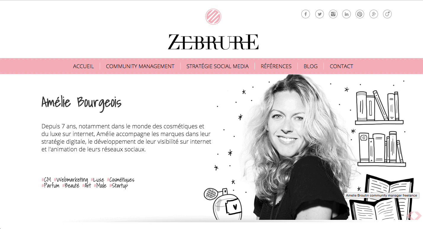
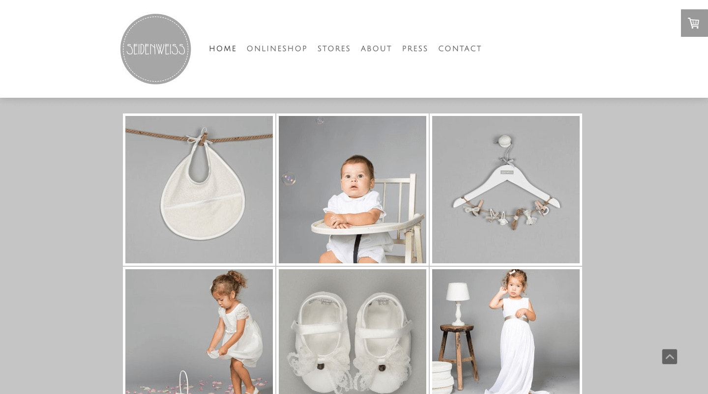
Flip through the slideshow below of Jimdo websites to see different colors in action.
Reflect your brand personality
Defining your brand personality helps the right people find you, so make sure to evoke the right feeling through color psychology. If you’re not sure which colors paint the right picture, try this interactive color quiz from online creative platform 99designs. Depending on the personality you want to emulate, adjust the slides on values from tone, energy, and age and more for an intelligently matched option. Common color choices vary by industry as well, so check out their research on the most common choices in industries from marketing, to real estate, to retail and more.”
Three website color strategies for beginners
There are as many ways to approach colors as there are, well, colors in the rainbow. If you’re a web design beginner, I suggest starting with one of these strategies:
1. Use one bright color with black and white
Think of color as a spice for your website—like any strong flavor, a little goes a long way. Bright colors grab attention but they also consume your visitors’ mental energy. If you’re new to using colors, one of the best approaches is to keep most of your site black and white, with one accent color that really pops.
For example, look at how the Unger Music website uses the same orange hue in their logo, background, horizontal lines, and navigation menu, while the rest of the site is predominantly black and white. The result is professional and sophisticated, rather than over-the-top.
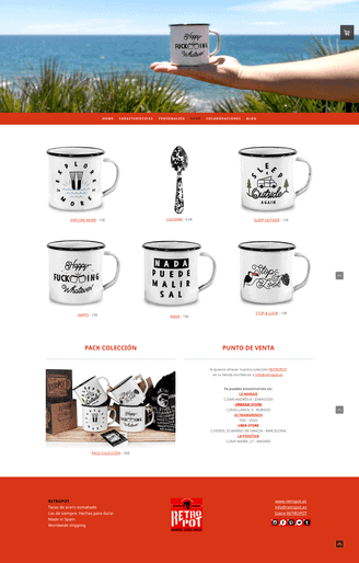
The same goes for the Retropot website. The red accent color helps the black and white graphic mugs stand out, and makes the site more fun and interesting to look at. Since it’s a bright red, they use it sparingly.

When you pick an accent color, here’s a few places you might use it on your website:
2. Use a primary and a secondary color
If one color doesn’t seem like enough, choose two. But rather than using both colors equally, the trick is to choose one as your “primary” color and the other as your secondary, meaning that you’ll use it much less often. That way the colors complement rather than compete with one another.
Take a look at the two Jimdo websites below. They’re very different websites, but they’re actually using similar colors.
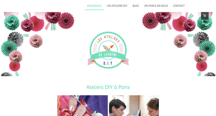
In the first website, notice how Laurène uses a background image that echoes the turquoise and pink colors in her logo. Then, she used the turquoise (her primary color) in her navigation and Heading Elements too. Over the rest of the site, pink makes an occasional appearance to tie it all together, but it doesn’t appear as often as the turquoise.
Kai uses a similar approach on his band’s website. Most of the site is in black and white, and they use turquoise for their navigation menu and Heading Elements. The pink makes only an occasional appearance in Button Elements and in their Blog Display Element. Using the pink sparingly means that when they do, it really pops out.

3. Present your colors through photographs
Most of the color changes we’re talking about here you can do in the Jimdo Style Editor, by changing your background colors, headings, etc. But if you’re into photography, you can also use the photos on your website to tell your color “story” and complement your brand identity.
For example, take a look at the Le Velo website, below. Bike shop owner Senad has created what is essentially a black and white website—his background is white and his text is black. The color on his website comes entirely from his photographs, which all share the same blue/green and brown hues. Cool, right?
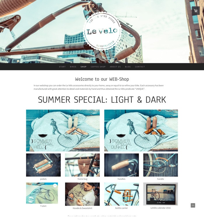
It takes a bit of discipline to use consistent color in your photographs. To pull it off, it helps to know how to edit your photos or at least put consistent filters on them.
Here’s one more example of a Jimdo website that’s using a three-color palette and incorporating those colors through all her photography, too. I love how artist Sami Garra uses a distinct green, pink, and yellow throughout her site. Every photograph references at least one of those colors. Check out her About Page too, and you’ll see that even her hair color and real-life workshop use those colors too! Talk about dedication!
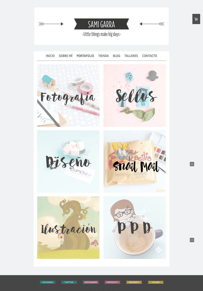
Ok, so you don’t actually have to change your hair color to match your website (if you do, please send us a photo!) But looking at these examples, hopefully you can get a sense of how powerful color can be when you use it consistently, even if your preference is to just use a little splash of color here and there.
Where to get ideas for website colors
Now that you have a better idea of your color strategy, the fun part is actually picking the exact color you’d like to use. The nice thing is that color inspiration is all around you. Here are some ideas:
What’s a color code? When you see a color you like, you can use it on your Jimdo website by finding that color’s RGB or hex value. These are unique codes that identify the exact color you’re looking for, and they’ll usually look something like RGB (26, 119, 127) or #E82C0C. Once you have the color code, use Jimdo’s Style Editor to recreate the color by pasting the code into the color selector.
Look at material and brand colors you already have
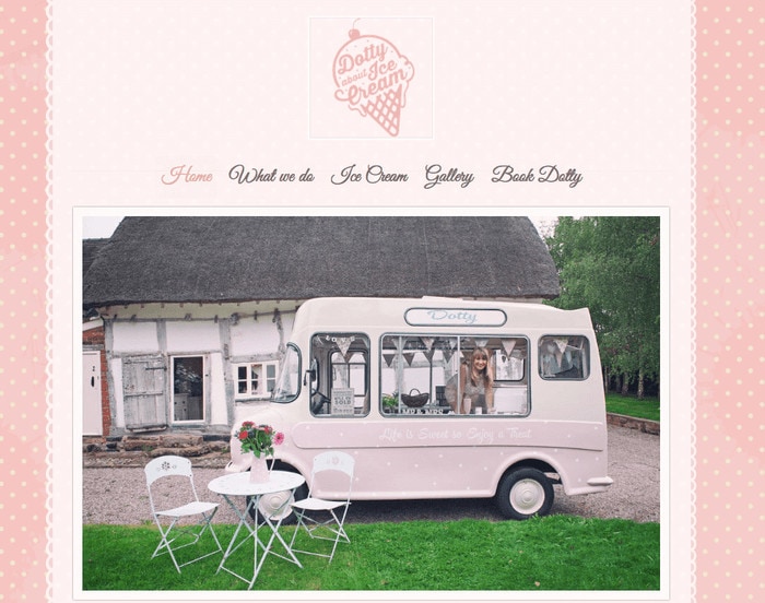
If you already have a logo, product packaging, or a color that you use consistently in your work, that will be a natural fit for your website. Maybe it’s a color you use in one of your products, or in the case of Dotty About Ice Cream, maybe it’s the color of your vintage ice cream truck!
The color for the Dotty About Ice Cream website comes straight from the vintage pink ice cream truck.
If you already have a professionally designed logo, your designer can tell you what your color codes are. Or, you can upload your logo file to a free program like Color Code Picker and it will tell you the colors in your logo.
Choose a color from a photograph you like
Most Jimdo templates have space for a full-width background or header image. If you already have the perfect photograph in mind (or have found one on the many free stock photo websites now available), an easy next step is to choose colors to match it.

In this sample website, we changed the menu bar and buttons to match the yellow tree in the background photograph.
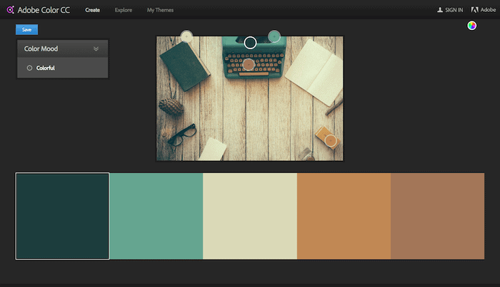
To match the color in a photograph, upload an image file (or your logo file) to Adobe Color CC and this free site will generate a color palette to match. Move the circles over the exact part of the image you’d like to replicate. Here I’ve uploaded a stock photo from Unsplash to the Adobe program to see if I can find the color of that beautiful green typewriter.
Find color inspiration on other people’s websites
One of the best ways to start designing your website is to browse other people’s sites to see what catches your eye. If you see a color you like, find out the exact color code using a free tool like ColorZilla or EyeDropper in Chrome or Firefox. Install it in your browser and turn it on when you want to take a sneak peak under the hood of another website.

The ColorZilla browser plugin will tell you exactly what color your favorite websites are using. Just drag your mouse over the color you like, and it will give you the color code at the top. Here it shows that the yellow on Jimdo’s website is #FCEC59.
Check out online color resources
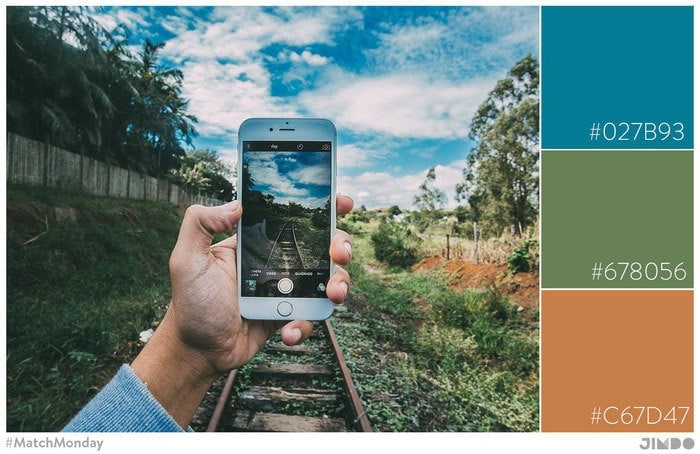
There are lots of fun websites for color connoisseurs to share their favorite palettes and color combinations. Many of them provide the color codes so that you can copy the colors on your own site. Just remember that a lot of these sites will provide extensive palettes with 5-6 colors or more, which is probably more than you need. Just pick a couple from your favorite palette and start from there.
Ok, you’ve picked your colors. Now what?
Let’s say you have picked one or two colors that you really love, and you have the unique color codes (either RGB or hex value) to go with them. (Wait, what’s a color code? If you missed this step, go back to “Where to get color ideas” above or check out this more detailed tutorial on how to find a color code, because it’s important for this next bit).
Now you get to decide where you want to use this color on your website. In Jimdo’s Style Editor, you can set the color of your text, links, menus, buttons, horizontal lines, and more. Almost every type of element has a color setting that you can adjust in the Style Editor, including Store Item Elements and Contact Forms.
If you want to adjust the color of your Large Heading Elements, for example, open up your Style Editor and click on the Heading Element. You’ll see the design options open in the black bar at the top of the screen. Click on the color box to open up the color menu. Then, enter your color code in the box highlighted in red below. If you type in the hex code, Jimdo’s system will automatically convert it to an RGB code, but the results will be the same.
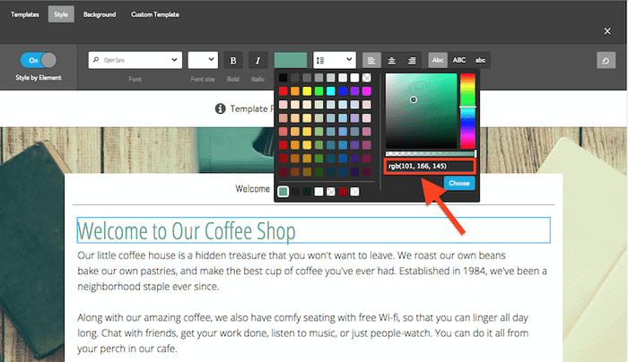
Now that color will always appear in the bottom row of your color palette so you can use it repeatedly for different elements.
Pro Tip: Want to change the color of your social media icons to match? Use a site like iconmonstr to create free icons with your exact color code, and then upload them to your website as Photo Elements.
Set a color scheme for your entire website
If you want, you can repeat this step for each of the element types you’d like to change. Or, you can do this faster by applying that color to your entire website at once. Here’s the trick:
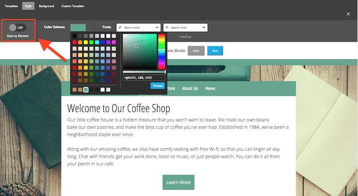
- Open the Style Editor and toggle the Style by Element switch to the “Off” position.
- When you do this, you’ll see the option to select a Color Scheme for your entire website.
- Click on the Color Scheme box, then enter your color code into the color picker like you did before.
- Press Choose, and you’ll see this color appear throughout your website—in your navigation, footer, links, horizontal lines, and more. The exact places the color will appear depend on the template you’re using, so give it a try and see what you think! If you like it, press Save. If you don’t, just select Undo.
- Once you set your Color Scheme, you can always flip the toggle switch back to the “On” position and adjust individual elements as you like.
Pro Tip: Want to play it safe to start? Start by changing the color of your Heading Elements, Horizontal Lines, Buttons, and maybe your Navigation Menu. That will add some fun color to your website without risking it being too overwhelming. Then, when you feel ready, you can try changing more elements and see how that looks!
Color, text, and contrast
Okay, the last thing to think about before you get started. When you’re working with color, there’s another factor to consider that goes beyond both aesthetics and emotions, and that’s providing a good user experience for your visitors.
Before you change your background and fonts to two colors that look nice together, make sure that there is still enough contrast between the two so that the text is still easy to read.
The higher the color contrast between the text and the background, the better your readability will be.

If black text on a white background doesn’t appeal to you, you can still have some fun with colors, but ideally, it’s best to stick with a dark font on a light background.
Want to build your own page? Here’s how you create your website!
Color Conclusions
We’ve covered a lot of ground in this article so I hope you’re feeling inspired to get started rather than daunted. To sum it up, here are some tips to keep in mind:
- Start by picking just one, maybe two colors and using them consistently throughout your website. There’s nothing wrong with most of your website staying black and white!
- For maximum readability, keep your background light and your text dark.
- If you have a color in mind, you’ll need to find its color code to match it exactly on your website.
- Once you have your color code, it’s easy to paste it into the Style Editor and use it consistently on elements throughout your website.
- To go even further with color, see if you can start matching your colors to your photographs.
Any other color tips you’d share with Jimdo users? Let us know in the comments.


